
Thank you all so much for filling out my blog reader survey! There have been over 700 participants so far and I know there are more of you who haven't had the chance to fill it out yet, so I'm going to continue gathering responses for another week or so before I share the results with you. Click here to go to the survey if you haven't taken it yet!
I've been having a blast reading through the responses. I feel so blessed to get to do what I do and interact with great people on the web. Many of you are sharing that you love the tips, to keep them coming and that you'd specifically like to know more about my editing process. You'd also like to see more Behind the Image posts. I'm happy to do more, I just need to know which images you'd like to learn about! Leave a comment or drop me an email!
I've covered so many FAQs over the years and have some great stuff in the archives. If you love tips, make sure to click on the FAQ category of my blog to see more!
I thought it would be fun to revisit some of the FAQ topics I wrote on back in the day -- revisit and update. So I'm going to start today by talking about skin tones. To see the original post from over 2 years ago, click here.
I do have some strong opinions on skin tones. I know that the choices photographers make in this area can be somewhat subjective but in my subjective opinion, they should look as natural and clean as possible. Unfortunately, as I scan through some blogs out there I grimace at some photographers' color correcting choices. In this area, I think actions have hurt us more than they've helped us. We think that we can just run an action that we like on any photo and it will look good. Not so much the case.
First of all, I shoot everything in RAW on auto white balance so I can make my choices for white balance when I have more time on the computer after the shoot. I know many photographers are trying to get their white balance correct in camera and I applaud them. If you can -- go for it! For me it's just one more setting to change and pay attention to. I feel like when it comes to white balance, it is easily tweaked on the computer and there's really no harm done to the image if you don't get it perfect in camera.
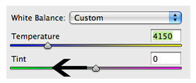
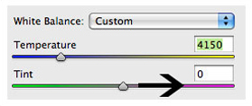
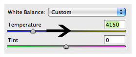
I shoot a Canon 5D mark II and the auto wb actually works pretty well. Then I color correct my images in Camera RAW in Photoshop. These two little sliders are the only things I use to adjust the skin tones:
I've been having a blast reading through the responses. I feel so blessed to get to do what I do and interact with great people on the web. Many of you are sharing that you love the tips, to keep them coming and that you'd specifically like to know more about my editing process. You'd also like to see more Behind the Image posts. I'm happy to do more, I just need to know which images you'd like to learn about! Leave a comment or drop me an email!
I've covered so many FAQs over the years and have some great stuff in the archives. If you love tips, make sure to click on the FAQ category of my blog to see more!
I thought it would be fun to revisit some of the FAQ topics I wrote on back in the day -- revisit and update. So I'm going to start today by talking about skin tones. To see the original post from over 2 years ago, click here.
I do have some strong opinions on skin tones. I know that the choices photographers make in this area can be somewhat subjective but in my subjective opinion, they should look as natural and clean as possible. Unfortunately, as I scan through some blogs out there I grimace at some photographers' color correcting choices. In this area, I think actions have hurt us more than they've helped us. We think that we can just run an action that we like on any photo and it will look good. Not so much the case.
First of all, I shoot everything in RAW on auto white balance so I can make my choices for white balance when I have more time on the computer after the shoot. I know many photographers are trying to get their white balance correct in camera and I applaud them. If you can -- go for it! For me it's just one more setting to change and pay attention to. I feel like when it comes to white balance, it is easily tweaked on the computer and there's really no harm done to the image if you don't get it perfect in camera.
I shoot a Canon 5D mark II and the auto wb actually works pretty well. Then I color correct my images in Camera RAW in Photoshop. These two little sliders are the only things I use to adjust the skin tones:
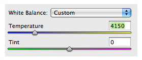
Side note: For those of you who use Lightroom, these sliders work the same way. Another side note: the screen shot of these sliders does not reflect the actual temperature and tint settings in the following examples. And I don't really pay attention to the numbers -- I just work by sight.
I'll now give you some examples to show you what I think is the good, the bad and the ugly in skin tones and show you how I fix the ugly with these fun and o-so-easy-to-use sliders. This is a little tough to do on a blog because each of your monitors is calibrated a little differently than mine so it's hard to know if you are seeing what I'm seeing with these little changes. But we'll give it a go if you will note this disclaimer :).
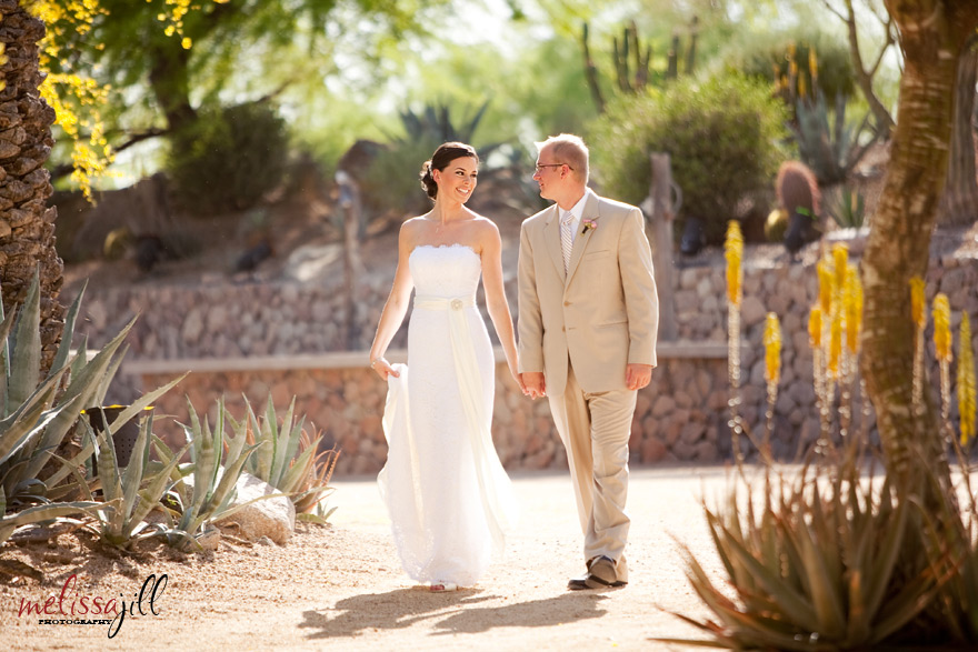
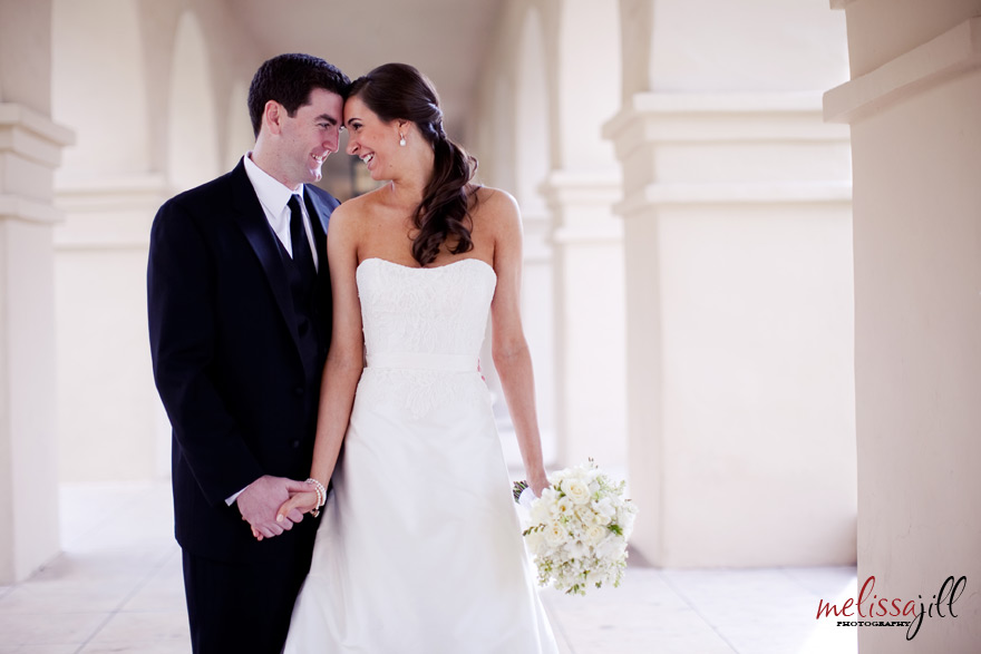
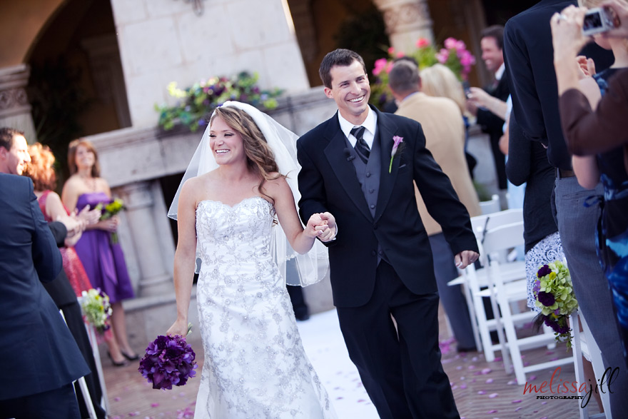
The most common faux pas I see on blogs these days is the too-warm image:
I'll now give you some examples to show you what I think is the good, the bad and the ugly in skin tones and show you how I fix the ugly with these fun and o-so-easy-to-use sliders. This is a little tough to do on a blog because each of your monitors is calibrated a little differently than mine so it's hard to know if you are seeing what I'm seeing with these little changes. But we'll give it a go if you will note this disclaimer :).
The most common faux pas I see on blogs these days is the too-warm image:
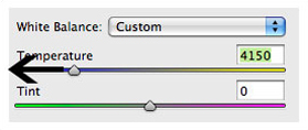
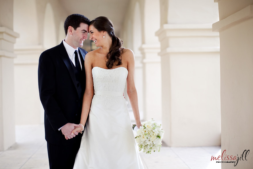
Not so clean and natural looking. In this case, I would bring the temperature down just so:
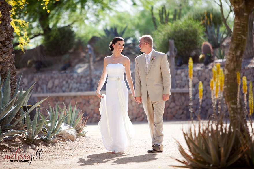
Ahhhh:
A second less-common blunder is to have too much magenta in an image:
In this case I would bring the tint down a tad:
To get this:
The opposite of too much magenta is too much yellow/green:
This is the case in which you should bring the tint up:
To attain this:
This final case I rarely see but thought I would mention nonetheless. This is what an image looks like that is too cool:
To add warmth bump up the temperature (but be careful not to go crazy as this is where many photographers slip up):
The result:
Any combination of sliding the temperature and tint up or down could be the right combo for the skin tones in any given image. The challenge is to train your eye to see color in an image, much like we train our eye to see compositional elements that make an image interesting or the way we train our eye to see how light is affecting a subject.
For what it's worth, I find myself most often bringing the temperature slightly down and the tint slightly up (more magenta). This is a total generalization but that's the most common combo I find my images needing for the desired result.
That concludes Color Correction 101. All comments, questions and snide remarks are welcome below. :) If you found this tip helpful, click here to find out about other resources I offer photographers!
Comments


